Scale and Proportion: The Secret to Sizing in Interior Design
Scale and Proportion: The Secret to Sizing in Interior Design
When it comes to the form and functionality of interiors, keeping things in proportion is imperative to achieve a well-balanced aesthetic design that works well for daily living. We hear the phrase: “Don’t let something get blown out of proportion” as commonly as we find spare change. In nearly all aspects of life, it is key to find and maintain a sense of balance, so as not to let something become unreasonably imbalanced with respect to how much physical space it occupies.
This is no different when we are talking about interior design. When I curate a room the way my client envisions, I help bring their imagined ideal space to reality. In some cases, I guide them through the entire process of imaging or reimaging their interior. Moreover, I always bear in mind the importance of arranging the end result with a substantial focus on scale and proportion.
Designing according to scale and proportion is one of the most proven techniques there is for successful interior renovation and design, as it invariably presents my clients time after time with finished spaces that don’t leave them feeling over- or underwhelmed. When used properly, the powerful combination of scale and proportion helps bring balance to rooms through seamlessly blending the attention-grabbing qualities of larger objects with the quaint, homey qualities of their smaller counterparts, and allowing both to make for an awe-inspiring final look.

The photo above is an excellent example of the idea I’ve just described. This space was a bit challenging to layout, since foyers and hallways tend to prove more difficult to plan than designated rooms, as they are not designed to be as heavily occupied. Yet, these spaces in homes are so very important, given they are often the welcoming entrances for guests.
For this foyer, I used scale and proportion to turn what ordinarily would be a fairly cumbersome object, into an eye-catching focal point that ironically brought both visual appeal and musical harmony to the area. My goal was to place my client’s prized baby grand piano as a foyer centerpiece at the foot of the stair.
Had it been a full-size grand piano, using it in the foyer might have gone overboard in accord with the space. Placing too-large a piano or furniture there would have not only thrown off the balance of the space, but also perhaps proven to be more of an inconvenience than an accentuation. Contrasted with the turning staircase, the foyer is far more fitting now.
Through also opting to hang an impressive oil painting of a landscape opposite the instrument, the wall’s style presence became enlarged visually and, therefore, rounded out the appearance of the room altogether.

In this case, I applied some of the same basic principles of equilibrium in regard to furnishings, while thinking big for wall decoration.
I wanted to equip this attractive sitting room with a refined, traditional vibe that would be in sync with select sections of the space that contain brick rather than drywall. The moderate-sized and sophisticated items in the room provide for unmatched juxtaposition with the original, tall brick walls and exposed ceiling. The result exudes a feeling of composed scale.
I opted for neutral-hued furniture that consisted of a plush sofa and four individual chairs in a U-shaped seating arrangement, rather than installing two sofas or settees facing each other. This seating type allows for symmetry and balance in a more creative approach to both interior style and lively conversation. The glass table in the center follows suit with the pattern, being quite relaxed and blending among the setting. Its mirror-glass top and simplistic gold trim and legs are very much in line with the rest of the room’s proportion.
By contrast though, yet adhering to the main theme, the paintings on the walls are the focal points and able to operate as statement pieces in generating dimension with their massive sizes. In strategically being placed between flanking high-top tables rather than alone, the art’s volume offers the room plenty of depth and helps maintain the scale and proportion factor- simply by invoking the right amount of artistic attention within the scope of the area.
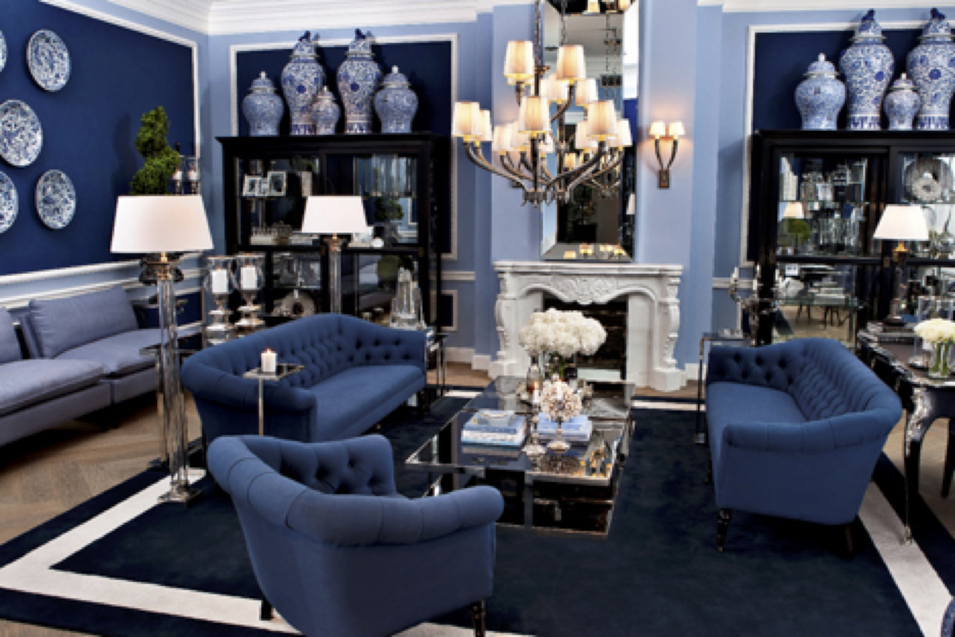
This Eichholtz arrangement, in a few ways, echoes the one above by creating a common area with relatively moderate-to-smaller furniture arranged around a unifying center table and gorgeous flowers. However, unlike with the previous example, scale and proportion serve different purposes here that attract attention in just the opposite way. In this context, they are executed by playing on the strengths of bold, eye-catching wall color, upholstery and decor as a way to well-appoint the room rather than via one prominent focal point.
The royal and sky blue color patterns offer a refreshing aesthetic beauty that effortlessly meshes with the similar colors in the decorative ceramics. Scale is especially at work above, since the size of the accessories is just enough to make them stand out from afar on the shelves, yet their positioning keeps them from making too much of a statement and detracting from the symmetry of the room.

Scale and proportion exert themselves in much the same way in the above expansive great room. The key difference is that instead of aiming to coordinate this room’s balance using numerous decorative items, I felt it would be more suitable to simply use fewer, less conventional objects to accomplish the same task.
The structure of this living-dining room allowed me to get creative and accessorize freely, which is why I went for a modern, simplistic theme to develop the primary area of the great room with oversized metallic, ball-like art fixtures on the wall. Though they are not as prominent, the metallic art pillars to the right side of the living area help anchor the aesthetic of the wall art by giving them something with which to correspond. They are perfect scale additions to this space due to the slanted ceilings, which provided more height with which to work.
I divided the expansive room into two defined areas to acquiesce varied practical uses and justify scalability. The dining portion was distinguished conversely through unyielding, clean-cut furniture that kept the dimensions of the room intact as well as looking well-scaled and proportioned.

Here, I had the unique task of incorporating scale and proportion into a room that is, in essence, “two-in-one” as well. As can be seen, I installed two half-wall partitions to create separated scale. This helped define the space considerably and turned my focus this time towards working with the unique details of the flooring and archway to strike the appropriate chord as far as scale and proportion. I also designed impressive architectural elements such as iconic half columns and scalloped woodwork affixed to the wall, producing a look of drama facing the adjacent hallway. This also created height proportion between the back wall and tall architectural ceiling.
Color had a role in proportion, too, since it was one of the strongest elements I could play off of to arrange this room. In the forefront, I included stunning, large silver chests of drawers that blended effortlessly with the neutral tiling beneath. In doing so, I achieved proportion of opposites towards the rear of the space with smaller, gold furniture to blend as color-wise. I was able to amplify the room’s dimension by making it appear to stretch even further, so now a desk and writing area seamlessly leads to a main entry.
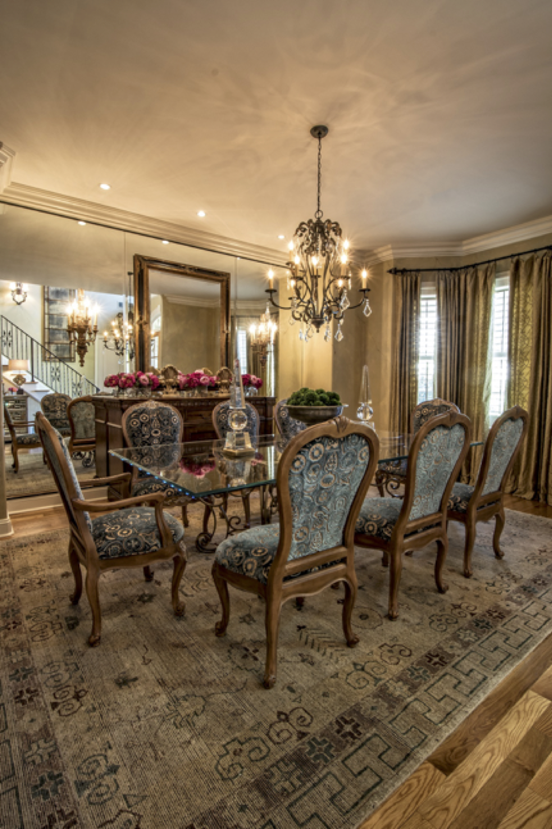
With this particular project, scale and proportion were utilized fairly differently, since this was an interior I wanted to accentuate in a much more centralized fashion. With it being a dining room and, therefore, a designated gathering space, I had to be more cognizant of what types of furnishings I could use.
Since a room such as this has a necessity for multiple chairs in one concentrated area in addition to a large center table, this meant I had to look to the outer areas of the room when it came to scale and proportion. The large mirror was one of my biggest aids in going about this, since its reflective nature by default adds further dimensionality and depth. The chandelier hanging directly above the table, too, is one component I thought would be an excellent choice for creating scale and proportion, since it is not overly complex, but still sizeable enough to keep the room from feeling incomplete.
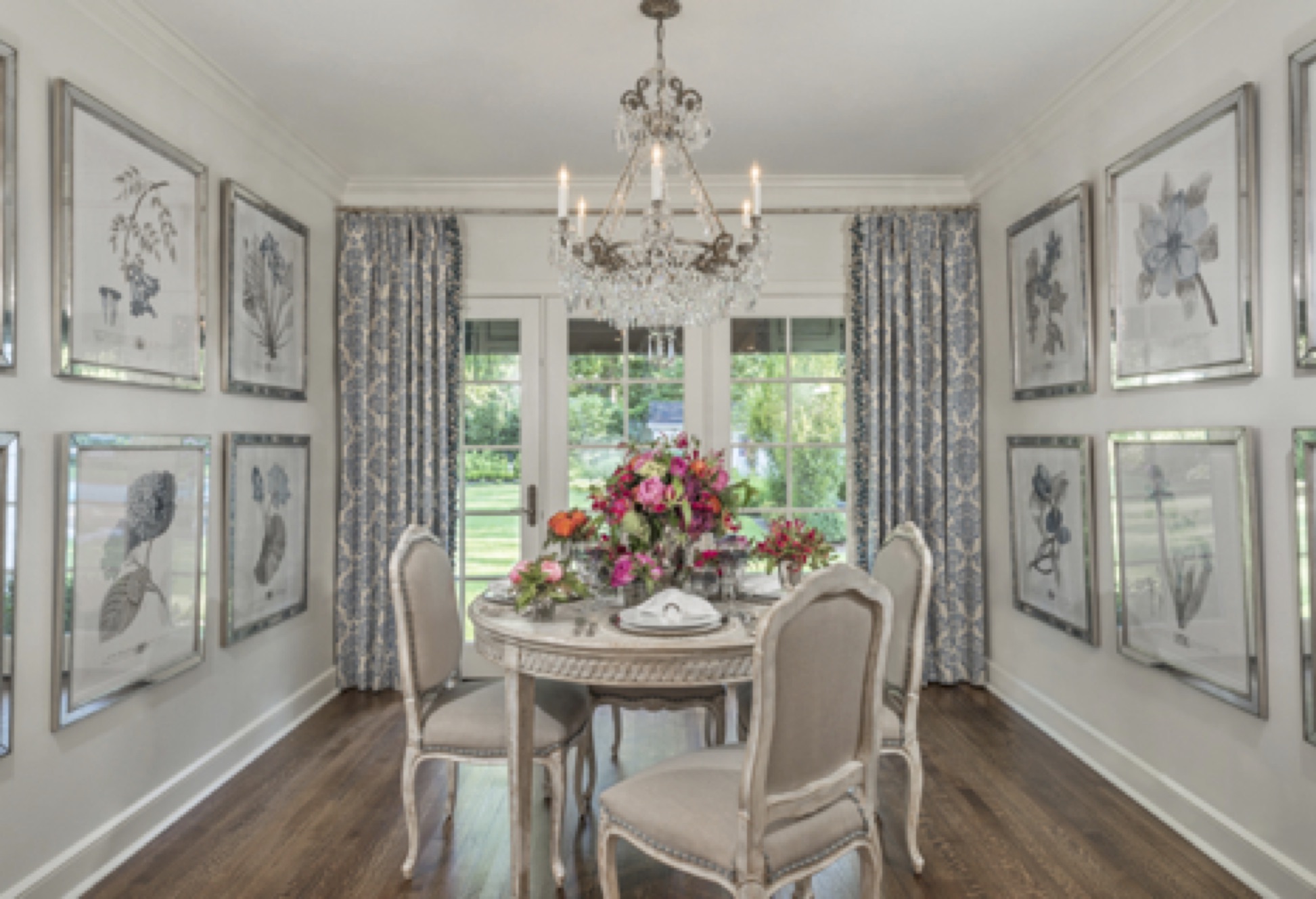
In the above-pictured eating nook, I kept things far simpler while designing with regard to scale and proportion. Deviating drastically from earlier examples, I conceptualized this room using art in a series for an even and uniform appearance. In keeping these lovely blue-gray botanicals consistently and neatly aligned with one another, I was able to spin them in such a way that makes them resemble paneling to an extent.
This strategy makes them a unique alternative to selecting one or two enormous art pieces for filling wall space. It offers aesthetic symmetry and allows the room to feel spacious, yet intimate all at once, and helps the chandelier and center table to steal the show as focal points.

With this last example, scale and proportion come into play quite uniquely. Similar to the first foyer photo in this blog post, this interior required me to apply high-level creative. But, this smaller entryway was significantly more confined. So, I had to be cautious and avoid overcrowding, which, of course, in smaller areas can happen very easily. I decided it would be best to rely on stand-out décor to serve as the points of focus. I chose pieces that were big enough to get the job done, without being overbearing.
By topping a breath-taking console with Lumiere candelabras, and a smoky glass center table with a vibrant, artistic floral arrangement, the essence was that of sizeable consideration, yet not distractingly so. This type of design in a smallish space can go a long way in providing enough balance, scale and proportion to function independently, as a collective attraction in its own right.
Managing scale and proportion when it comes to design can be difficult to execute in many instances, but the good news is a room’s size and dimensions afford near-countless, fun possibilities.
Whenever I assess a prospective project for a client, I make it a point to bring my tape measure with me, so that I can know how much I have to work with and what my selection and design processes should entail. It takes practice to pull both off perfectly, but in having amassed much experience through my work for numerous clients over the years, I can certainly say the end results are incredibly satisfying. Scale and proportion are indeed all about balance and are, without a doubt, one of my biggest tools for interior success.
XO, Ami Austin